Disclaimer: As this is reversed engineered it’s not guaranteed to work on every field and configuration of fields as only certain configurations were tested.
Creating a Unity base field
When creating custom fields for the Unity inspector or editor you’ll find that styling custom made fields to look like the Unity default can be quite hard. Unity uses a very specific styling to style their fields using the base-field classes. These classes are separately named per field and layered on top of each other for each specific field. Because the format isn’t exactly defined and undocumented it can be very hard to emulate the styling.
Here you can see an example of how the base field classes are named and applied on the fields. As can be seen there’s a whole lot of USS classes that are applied.

This problem drove me a little crazy while creating Unity UI’s with UI Toolkit. No mather what I did it was always just slightly off. So when I had the time (which turned out to be a year later) I reverse engineered it.
How I did it
I added an integer field to the UI and then opened up the UI Toolkit debugger. Copied the USS that was defined on the classes of the three elements that define a Unity base-field. Then made three USS classes using that USS. This can be used to emulate the styling of a Unity base-field. There were still a couple of things that weren’t quite aligned. So I debugged what wasn’t matching and added the custom USS to the classes.

Applying it
This resulted in the following code, the source for which can be found on Github. The commented out code was removed because it was used specifically for the IntegerField. Comments have been added to specify what styling came from which Unity USS class and to define what custom code was added.
.custom-unity-field-container {
    /* class: .unity-base-field     */
    flex-direction: row;
    flex-shrink:0;

    overflow: hidden;

    margin-top: 1px;
    margin-bottom: 1px;
    margin-left: 3px;
    margin-right: 3px;

    /* class: .unity-base-text-field  */
    white-space: nowrap;
    /*--unity-selection-color:rgba(0.239, 0.502, 0.875, 0.651);*/
    /*--unity-cursor-color: rgba(0.706, 0.706, 0.706, 1);*/

    /*      .unity-base-field__inspector-field*/
    margin-right: -2px;

    /*    Custom */
    margin-top:0px;
    margin-bottom: 0px;
}

.custom-unity-field-label{
    /* class: .unity-base-field__label    */
    min-width: 150px;
    padding-left: 2px;
    padding-top: 2px;
    padding-bottom: 0px;

    margin-top:0px;
    margin-bottom: 0px;
    margin-right: 2px;
    /*color: rgba(0.769, 0.769, 0.769, 1);*/

    /* class: .unity-base-field__label--with-dragger*/
    /*cursor: slide-arrow;*/

    /* class: .unity-label*/
    flex: 0 0 auto;
    margin-top:0px;
    padding-left: 1px;
    padding-right: 2px;
    white-space: nowrap;

    /*    Custom*/
    -unity-overflow-clip-box: content-box;
    margin-right: 0px;
    padding-right: 0px;
}

.custom-unity-field-value{
    /* class: .unity-base-field__input  */
    flex: 1 0 0;
    overflow: hidden;
    margin-top: 0;
    margin-right: 0;
    margin-bottom: 0;

    /* class: .unity-base-text-field__input*/
    padding-left: 2px;
    padding-right: 2px;
    padding-top: 1px;
    padding-bottom: 0px;
    /*cursor: text;*/
    -unity-overflow-clip-box: content-box;
    flex: 1 1 auto;
    /*background-color: rgba(0.165,0.165,0.165,1);*/
    border-width: 1px;
    /*border-left-color: rgba(0.129,0.129,0.129,1);*/
    /*border-top-color: rgba(0.051, 0.051, 0.051, 1);*/
    /*border-right-color: rgba(0.129, 0.129, 0.129, 1);*/
    border-radius: 3px;
    /*color: rgba(0.824, 0.824,0.824,1);*/
    /*-unity-sync-text-editor: true;*/

    /* class: .unity-base-text-field__input--single-line */
    -unity-text-align: middle-left;

    /* custom code   */
    margin-left: 0px;
    padding-left: 1px;
    padding-right: 0px;
    padding-top: 0px;
    padding-bottom: 0px;
}
These USS classes can be added to the three elements of the UXML to create a custom base field that emulates the Unity styling. Just add container-custom-label to the container, custom-unity-field-label to the label and custom-unity-field-value to the value field.
An example can be seen here:
<engine:VisualElement class="custom-unity-field-container">
    <engine:Label class="custom-unity-field-label" text="Custom integer field"></engine:Label>
    <editor:IntegerField class="custom-unity-field-value"></editor:IntegerField>
</engine:VisualElement>
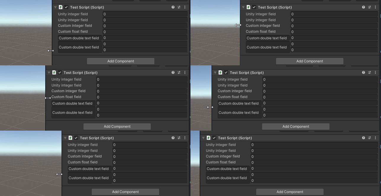
This will then result in the field to look, feel and scale like other Unity fields!

Special fields
As seen in the previous gif there is more that can be done using this USS then just a label and an input. For the experts who like to make new funky fields, the USS can also be used in the making of some more special custom fields. These are things such as using a TextBox for a field or using more then one input fields. This can be done but I can’t guarantee that it’ll work. So, be prepared to do a little debugging.
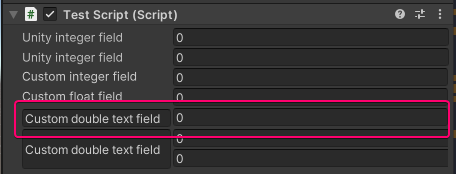
The main problem I found with making these kind of fields was that the margin-left on the field is not explicitly set to 0px causing a slight offset. This can be fixed using the style or it can be added to the classes if you’d like. But be aware that if it looks slightly off, it might be because the margin-left is not explicitly set to 0px.
Example of a field with a TextField for a label
<engine:VisualElement class="custom-unity-field-container">
    <engine:TextField class="custom-unity-field-label" text="Custom double text field" style="margin-left:0px;" ></engine:TextField>
    <editor:IntegerField class="custom-unity-field-value" ></editor:IntegerField>
</engine:VisualElement>

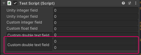
Example of a field with a TextField for a label and two input fields
<engine:VisualElement class="custom-unity-field-container">
    <engine:TextField class="custom-unity-field-label" text="Custom double text field" style="margin-left:0px;" ></engine:TextField>
    <engine:VisualElement class="custom-unity-field-value">
        <editor:IntegerField  style="margin-left:0px;"></editor:IntegerField>
        <editor:IntegerField  style="margin-left:0px;"></editor:IntegerField>
    </engine:VisualElement>
</engine:VisualElement>

Some whacky things can be done using this. But I’ll leave that up to you!
Conclusion
Custom Unity base fields can now be styled just like the Unity fields!😊